Philippa Jeffrey
Artist
Philippa Jeffrey Artist
Branding
E-commerce website
THE BRIEF
Philippa’s old website was dated and lacked any commerce functionality, making the conversion process convoluted and challenging for the collector. The brief was to create a completely new brand identity for Philippa that felt grown up and premium, yet still reflected her personality and unique aesthetic. The new look is smart and timeless but with plenty of bold colour and fun elements to keep the site on-brand. The site is clean, easy to navigate and give Philippa plenty of scope to promote her work, studio space and designs.


-
Before
Philippa’s old site was tired and dated. Content was limited and there was no facility for shopping her work online. The design and style of the site didn’t reflect her personality and it wasn’t visually engaging enough to allow the user to connect with Philippa and her work.
-
During
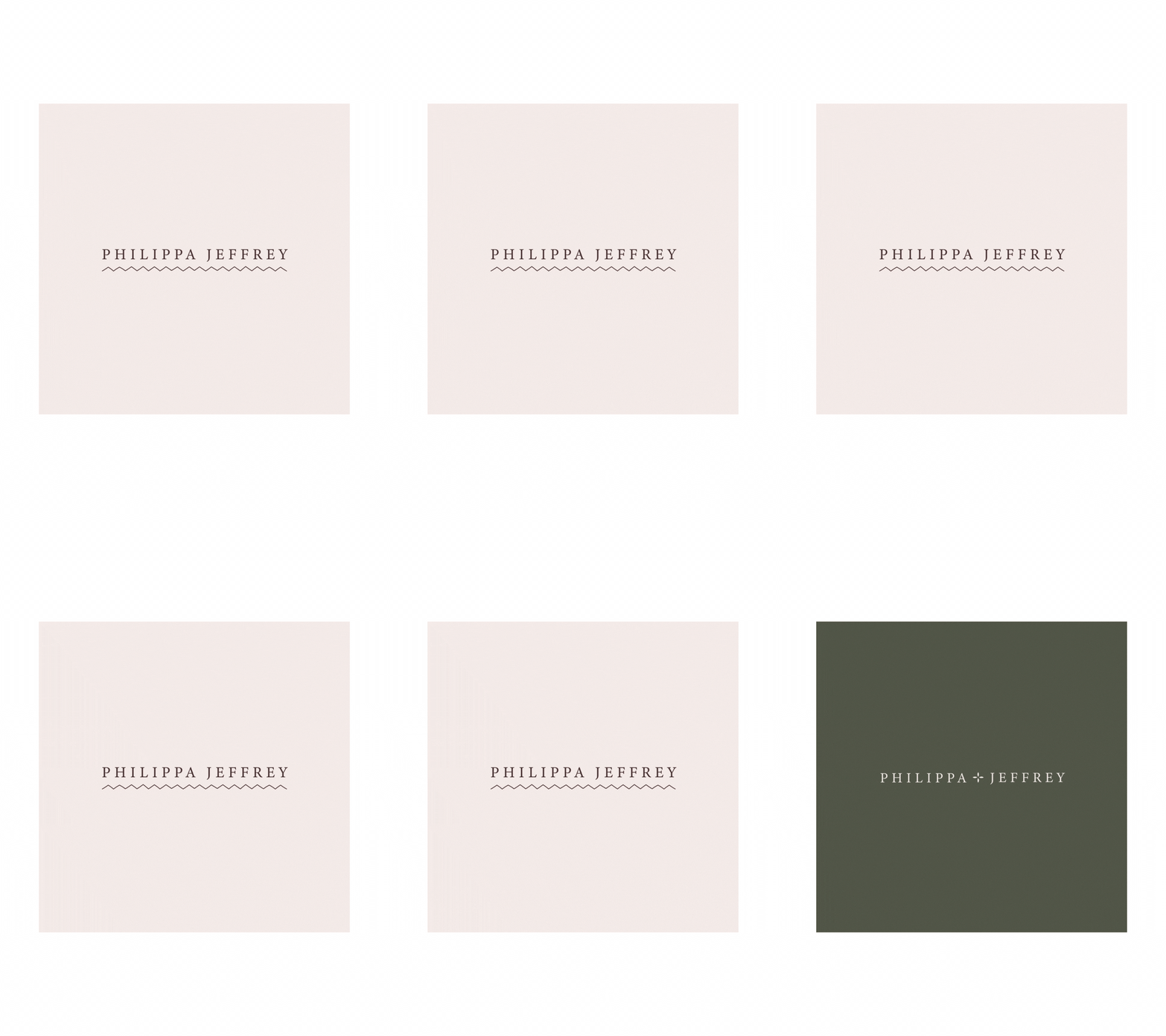
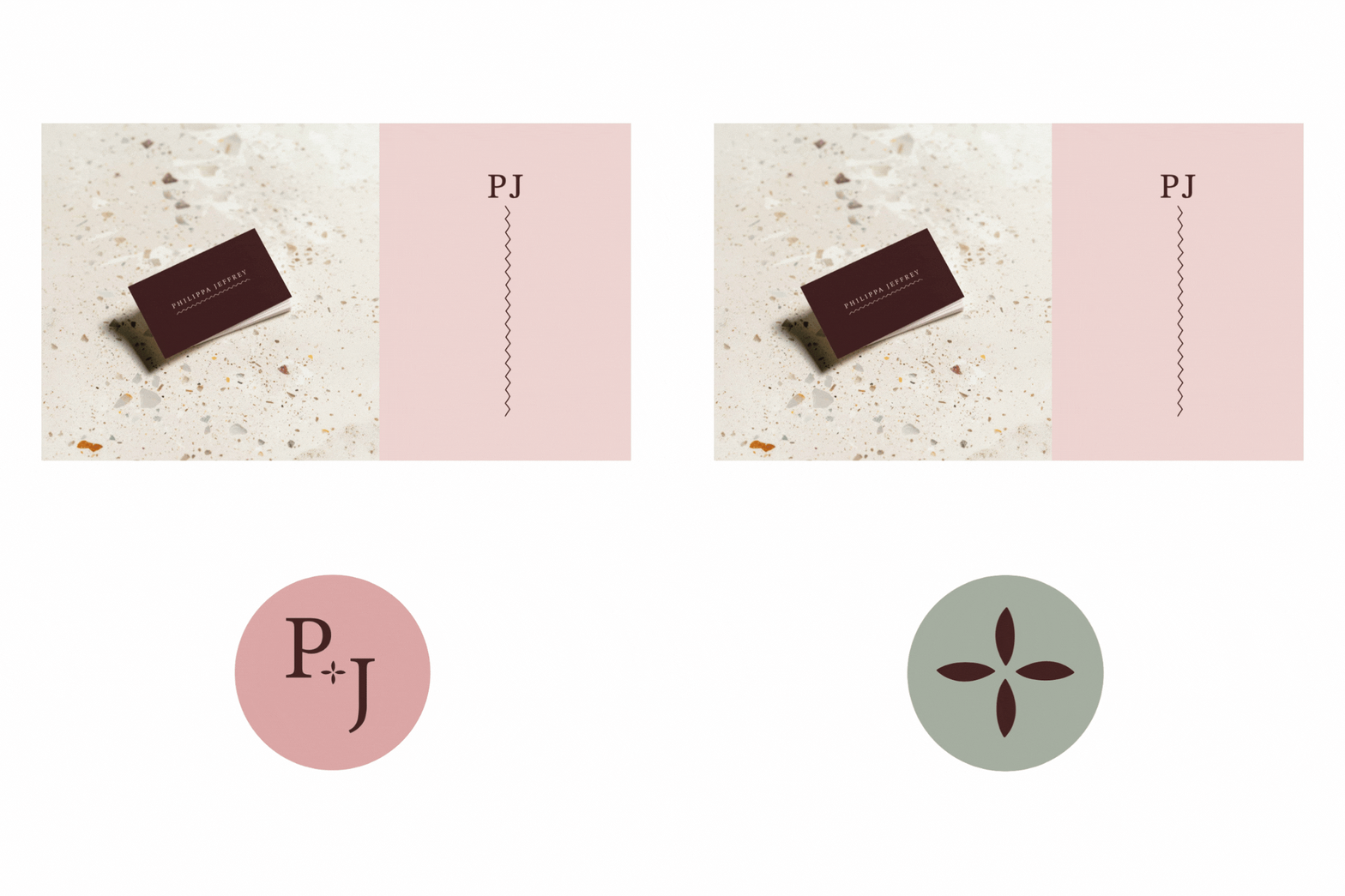
The colour palette was one of the most important parts of the branding, and we settled on a combination of rich, dark colours and paler tones to give plenty of flexibility. The decorative elements and icons all relate to Philippa’s practise or her studio environment, making them incredibly personal.
-
After
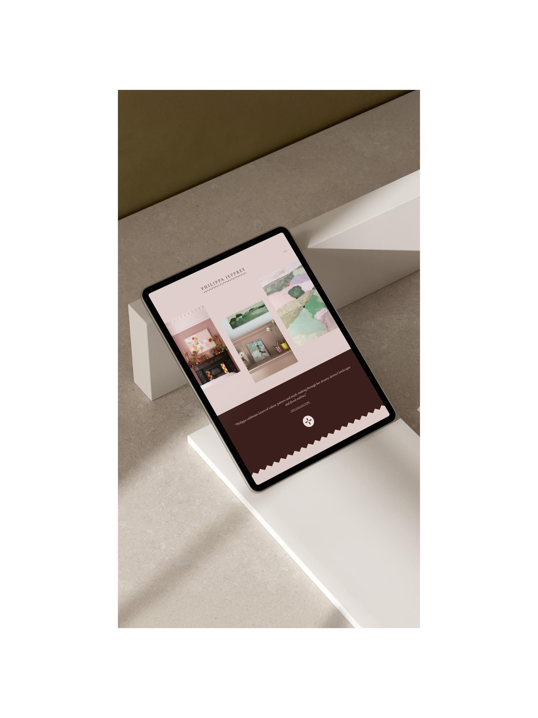
The finished site feels fresh and contemporary yet sophisticated and timeless. The strong colours and bold zig-zag shapes give the site visual impact without overpowering the work. Fonts are classical to balance out the abstract nature of Philippa’s practice, and the whole site is easy to navigate and clear.


